Unfortunately a great deal of websites put little or no effort into optimising their website design for mobile devices.
With the ever increasing use of mobile devices to access the Internet it’s becoming necessary update websites so they can be easily used from a mobile device. Fortunately this doesn’t necessarily mean you need to rewrite your website – if you already have a sound design using valid HTML and CSS there’s a good chance you can simply rework your CSS to add mobile support.
The following information will hopefully put you on the path to a mobile device compatible website.
First, some tips on making your website mobile device friendly:
It’s important to remember that even if users can see a website on a smartphone, it doesn’t necessarily mean that the site is mobile-friendly and easy to navigate. Below are ten tips to help you design a mobile-friendly site:
Keep it quick – Design your site to load fast and make copy easy to scan
How to make your website ‘print friendly’ using CSS
Step 1: Assess the website
The first step is to assess the website.
Using a mobile device try browsing through website – are you able to access all sections of the website. Are the links difficult (too small) to click? Is there excessive scrolling – horizontally or vertically? And most importantly, did you need to zoom to read the text?
Has valid HTML and CSS been used? A must if you’re expecting your website to operate reliably on any browser.
Are there any pictures of text (such as logos, headings or menus)? Special consideration will need to be given to these – if you reduce the size of the font you will need to reduce the size of these images.
What are the content areas of the website? Get to know the website, the content areas and how they are being used.
Can any of the content areas be removed whilst still allowing the user to use the website and access the information? Typically websites are composed of a header, footer, sidebars/sub-navigation, and one main content area. A quick an easy way to go mobile would involve removing at least the content at the side of the screen – remember less is more when it comes to small screen devices!
Step 2: Setup the CSS
There are two options for setting up the CSS – you can use an existing style sheet or create a new separate one.
Option 1: Using an existing style sheet (CSS file) – the easiest option
- Open your style sheet and add the following query to the bottom
@media only screen and (max-width: 640px)  {

}
Option 2: Using a new separate style sheet (CSS file)
- Create a new file called ‘mobile.css’ along with your other CSS files. In this example the file is saved to itsupportguides.com/template/css/mobile.css
- Add the following code to the ‘HEAD’ of your HTML document/template
<link rel="stylesheet" href="http://itsupportguides.com/template/css/mobile.css" type="text/css" media="screen and (max-width: 640px)" />
Step 3: Create the mobile friendly css
After viewing the website on a mobile device note the content areas which can be removed for the mobile website, the areas which have excessive padding, pictures which were too big and fonts which were too big.
Using a desktop PC, you now need to find the DIV ID’s, classes and other HTML tags for the content which needs to be changed on the mobile website.
The easiest way to do this is by using Firefox and installing the Firebug plug-in.
Firebug allows you to quickly identify each content area by point and clicking.
- If you haven’t already, install Firefox (http://www.mozilla.org/en-US/firefox/fx/) and the Firebug plug-in (http://getfirebug.com/)
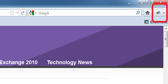
- Open your website and run the Firebug plug-in by clicking on the Firebug icon at the top right of the window

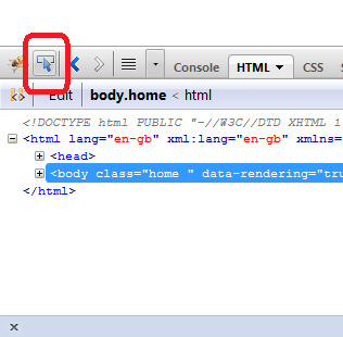
- Click on the pointer icon at the top left of the Firebug toolbar

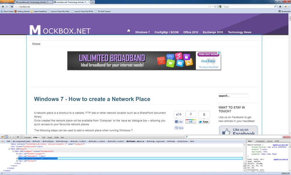
- Using your mouse, hover over your website. You will see a blue highlight around each content area as you hover over. Click on the content area which needs the mobile-friendly CSS.

- In this example we need to specify the width of the ‘main-content’ DIV element. From the right-hand side of the Firebug tool we can see the existing code (#main-content)
Step 4: Add the mobile-friendly CSS
- Using the CSS sheet you created in step 2 add your mobile CSS code. For example
-
#main-content {
    max-width: 99%;
    padding: 25px 0 30px;
} - Save the changes and reload the website on the mobile device.
Step 5: Repeat for each content area
Repeat for each content and content area you need to change.
Another common change is to disable specific elements, such as breadcrumbs, banners and menus.
You can do this by using the display: none CSS. For example:
#ads-top {display:none; }
.breadcrumbs {display:none;}
And as always – TEST! Test the new CSS using as many different devices you can find – iPhone, Android, Windows Mobile, mobile phones, tablets.