Linked text on websites needs to stand out for users to know they can click them.
On this pageJump to a section
But doing this right is surprisingly hard, because you need to finely balance the colour contrast between the background, non-linked text and linked text.
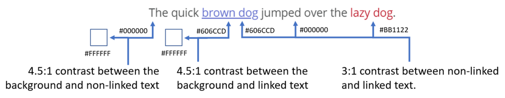
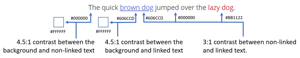
For maximum visibility I like to rely on the WCAG 2.0 AA standard, which defines the minimum contrast as:
- 4.5:1 contrast between the background and non-linked text
- 4.5:1 contrast between the background and linked text
- 3:1 contrast between non-linked and linked text.
When you start to look at these ratios you soon see how limited the colour choices are.
I typically stick to:
| Purpose | Colour (Hex) |
|---|---|
| Non-linked text | #000000 |
| Linked text | #606CCD |
| Hover | #BB1122 |
| Visited | #814181 |
Should links be underlined?
Links don’t need to be underlined (not even according to the WCAG 2.0 specification) – but underlined text is universally accepted as being a link.
If we refer back to the WCAG 2.0 standard we see that
- colour is not used as the only visual means of conveying information, indicating an action, prompting a response, or distinguishing a visual element.
- links with a hover or focus state must have a non-colour designation.
For these reasons I prefer to underline links in body copy (articles), making links underlined by default but not when hovered over.
Do visited links need a different colour?
It’s not necessary, but if you’re trying to stick to the WCAG 2.0 standard – it depends on if you think whether a link has been visited is information.
But even then – if the “visited” state is information to convey – it can’t be communicated just with colour.
Personally, I do not use a different colour for visited links.
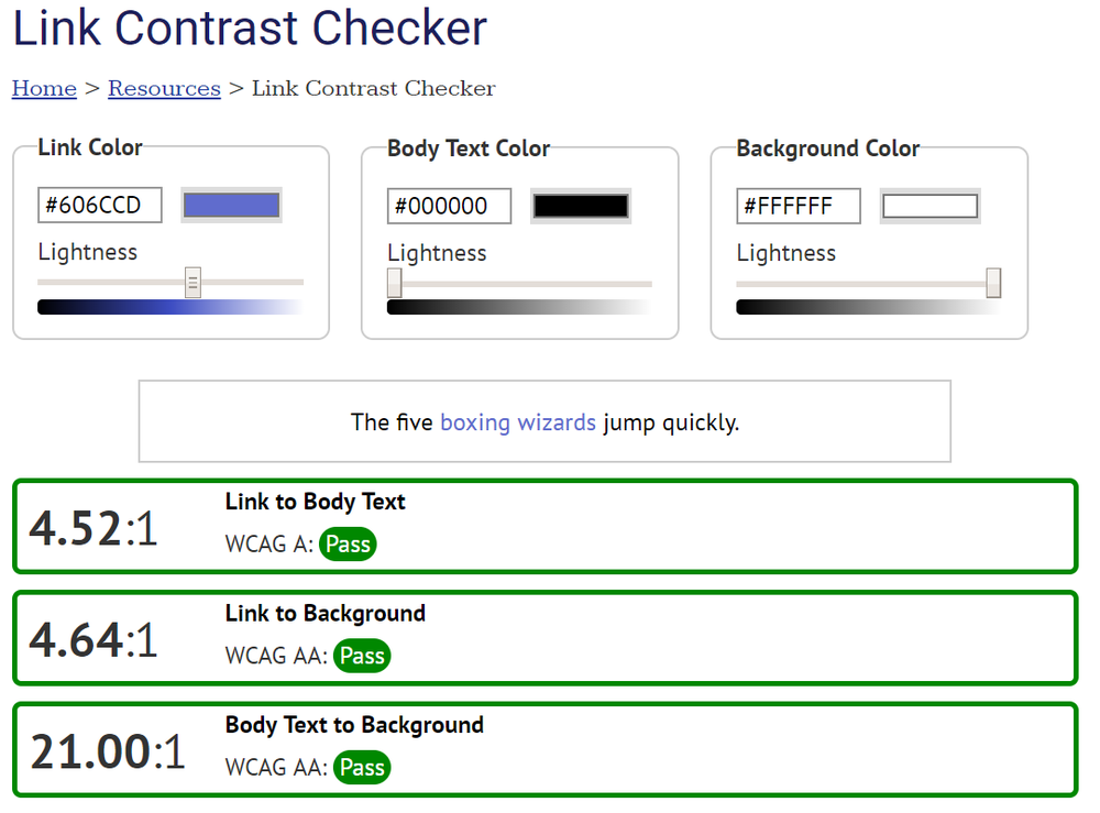
How to check colour contrast?
My favourite tool is the Link Contrast Checker by WebAIM.
It lets you pick a link, text and background colour and gives you the ratio and whether they’re OK.