jQuery Mobile is a touch-optimized web framework for smartphones and tablets. It allows you to create graphical user interfaces for mobile enables websites or HTML smartphone apps with ease.
On this pageJump to a section
The magic with jQuery Mobile is how it allows you to take advantage of predefined CSS and JavaScript to make standard HTML mobile phone friendly. It provides a number of widgets that simulate existing behaviour of mobile devices, like Apple iOS, Android, Blackberry etc. The idea is to provide a unified user interface that works across all popular mobile devices.
The following article will walk you through creating a jQuery Mobile multi-page template.
Step 1: Understanding jQuery structure
Before creating the template you need to have a basic understanding of the page structure required.
Page header
At the top of each page, in the header, you will need to reference the jQuery and jQuery Mobile framework as well as the jQuery CSS stylesheet. This should look like (please note – there may be a newer version of jQuery available. Please check the jQuery website here and here):
    <link rel="stylesheet" href="http://code.jquery.com/mobile/1.0a1/jquery.mobile-1.0a1.min.css" />
<script type="text/javascript" src="http://code.jquery.com/jquery-1.4.3.min.js"></script>
<script type="text/javascript" src="http://code.jquery.com/mobile/1.0a1/jquery.mobile-1.0a1.min.js"></script>
Basic page structure
Each mobile web page is divided into three parts – header, body and footer. DIV element and a special data-role attribute are used to inform the framework how it is displayed. Inside of each DIV element you place your page content in standard HTML such and <h1>, <p>, <ul>, <li> and etc. As an example, this will look like:
<body>
<div data-role="page">
<div data-role="header">
<h1>The Header</h1>
</div>
<div data-role="content">
<h1>The Content</h1>
</div>
<div data-role="footer">
<h1>The Footer</h1>
</div>
</div>
</body>
Multi-page structure
Similarly you can use single HTML files to contain multiple ‘pages’. This is done by adding ‘ID’s’ to the page div element. As an example, this will look like:
<body>
<div data-role="page" id="one">
<div data-role="header">
<h1>The Header - PAGE 1</h1>
</div>
<div data-role="content">
<h1>The Content</h1>
<p><a href="#two" data-role="button">Show page "two"</a></p>
</div>
<div data-role="footer">
<h1>The Footer</h1>
</div>
</div>
<div data-role="page" id="two">
<div data-role="header">
<h1>The Header - PAGE 2</h1>
</div>
<div data-role="content">
<h1>The Content</h1>
<p><a href="#one" data-role="button">Show page "one"</a></p>
</div>
<div data-role="footer">
<h1>The Footer</h1>
</div>
</div>

</body>
Link transitions
To give your HTML page a professional feel you can use link transitions, also know as ‘slides’. These will display an animation as a link is clicked and a new page is loaded.
As an example, the code for this would look like:
<div data-role="content">
 <ul data-role="listview" data-inset="true" data-theme="c" data-dividertheme="a">
 <li data-role="list-divider">Recent Articles</li>
 <li><a href='linka.php' data-transition='slide'>Link to page A</a></li>
 <li><a href='linkb.php' data-transition='slide'>Link to page B</a></li>
 </ul>
</div>
Step 2: Create the template
Copy and past the following example HTML into a file called ‘jquery_example.html’ and save to your local working directory or web server.
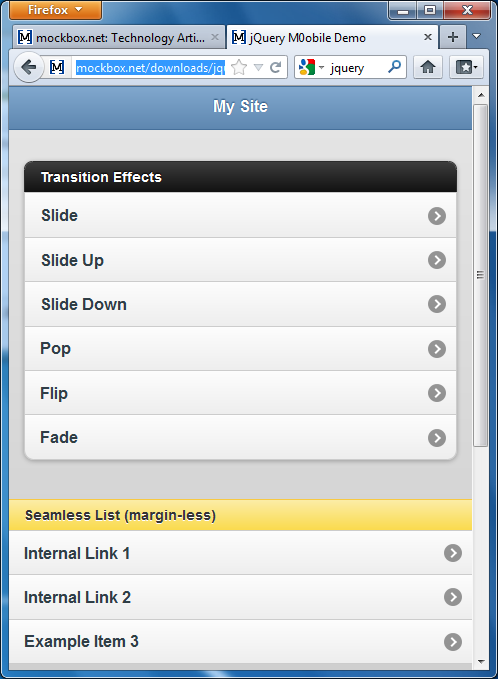
<!DOCTYPE html PUBLIC "-//W3C//DTD XHTML 1.0 Transitional//EN" "http://www.w3.org/TR/xhtml1/DTD/xhtml1-transitional.dtd"> <html xmlns="http://www.w3.org/1999/xhtml"> <head> <title>jQuery M0obile Demo</title> <link rel="stylesheet" href="http://code.jquery.com/mobile/1.0a1/jquery.mobile-1.0a1.min.css" /> <script type="text/javascript" src="http://code.jquery.com/jquery-1.4.3.min.js"></script> <script type="text/javascript" src="http://code.jquery.com/mobile/1.0a1/jquery.mobile-1.0a1.min.js"></script> </head> <body> <div data-role="page" data-theme="b"> <div data-role="header" data-theme="b"> <h1>My Site</h1> </div> <div data-role="content"> <ul data-role="listview" data-inset="true" data-theme="c" data-dividertheme="a"> <li data-role="list-divider">Transition Effects</li> <li><a href="#one" data-transition="slide">Slide</a></li> <li><a href="#one" data-transition="slideup">Slide Up</a></li> <li><a href="#one" data-transition="slidedown">Slide Down</a></li> <li><a href="#one" data-transition="pop">Pop</a></li> <li><a href="#one" data-transition="flip">Flip</a></li> <li><a href="#one" data-transition="fade">Fade</a></li> </ul> <br /><br /> <ul data-role="listview" data-dividertheme="e"> <li data-role="list-divider">Seamless List (margin-less)</li> <li><a href="#one" data-transition="slide">Internal Link 1</a></li> <li><a href="#two" data-transition="slide">Internal Link 2</a></li> <li><a href="#" data-transition="slide">Example Item 3</a></li> </ul> <br /><br /> </div> <div data-role="footer" data-position="fixed"> <h1>© Copyright Info or Site URL</h1> </div> </div> <div data-role="page" data-theme="b" id="one"> <div data-role="header" data-theme="b"> <h1>My Site - PAGE ONE</h1> </div> <div data-role="content"> <h1>This is an internal page 1 - the HTML is located in the footer.</h1> </div> <div data-role="footer" data-position="fixed"> <h1>© Copyright Info or Site URL</h1> </div> </div> <div data-role="page" data-theme="b" id="two"> <div data-role="header" data-theme="b"> <h1>My Site - PAGE TWO</h1> </div> <div data-role="content"> <h1>This is an internal page 2 - the HTML is located in the footer.</h1> </div> <div data-role="footer" data-position="fixed"> <h1>© Copyright Info or Site URL</h1> </div> </div> </body> </html>
Step 3: Open the template
When you open the template you will see how simple it was to apply the mobile friendly style to the HTML.
Link: www.itsupportguides.com/downloads/jquery_example.htm
For further information on what jQuery Mobile can offer see: http://jquerymobile.com/test/docs/pages/page-anatomy.html