In this article, we’ll explore 5 pro tips that will make your CSS code more enjoyable to work with, maintainable, and efficient.
On this pageJump to a section
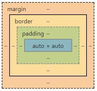
1. Master the Fundamentals: The CSS Box Model
 Before getting into any advanced CSS techniques, it’s crucial to have a solid understanding of the basics, and that starts with the CSS box model.
This foundational concept is essential for grasping how elements are laid out on a webpage.
- Think of every HTML element as a box.
- Inside the box, you have the content (with width and height).
- Padding surrounds the content, followed by a border and an outer margin.
- Internet browser developer tools can help you visualize and inspect the box model.
By understanding the box model, you’ll have a clearer idea of how elements interact and how to control their positioning and sizing.
2. Embrace Modern Layout Tools: Flexbox and Grid
Flexbox and Grid are modern CSS layout tools that make it easier to create responsive designs.
Flexbox
- Use
display: flex;to create a flexible column or row. - Control the alignment and positioning of child elements using properties like
justify-contentandalign-items.
For example, this CSS code creates a container with three boxes inside it. The boxes are spaced evenly using the flexbox layout and justify-content property.
<style>
.container {
    display: flex;
    justify-content: space-around;
}

.box {
    width: 100px;
    height: 100px;
    background-color: lightblue;
    border: 2px solid black;
}
</style>

<div class="container">
    <div class="box"></div>
    <div class="box"></div>
    <div class="box"></div>
</div>
Grid
- Set
display: grid;to define a grid layout with rows and columns. - Use
grid-template-columnsandgrid-template-rowsto set the size and structure of your grid.
For example, this CSS creates a grid layout with 3 columns, each 100 pixels wide with a 10 pixel gap, and applies a light blue background color and black border to elements with the class “box” within the container.
<style>
.container {
    display: grid;
    grid-template-columns: repeat(3, 100px);
    gap: 10px;
}

.box {
    width: 100px;
    height: 100px;
    background-color: lightblue;
    border: 2px solid black;
}
</style>

<div class="container">
    <div class="box"></div>
    <div class="box"></div>
    <div class="box"></div>
</div>
3. Responsiveness Made Easy: Min, Max, and Clamp
To create responsive designs without the headache of managing multiple media queries, try using min, max, and clamp functions.
min(): Use the smallest value among the provided arguments.max(): Use the largest value among the provided arguments.clamp(): Set a value within a range, using a minimum, maximum, and preferred value.
These functions can significantly reduce the amount of code needed for responsive layouts and make your CSS more efficient.
For example, this CSS sets the font-size of an h1 element to a responsive size that ranges between a minimum of 24px and a maximum of 36px, dynamically adjusting based on 4% of the viewport width (4vw).
h1 {
  font-size: clamp(24px, 4vw, 36px);
}
4. Keep Your CSS Flexible: Custom Properties (Variables)
CSS custom properties, also known as variables, are a powerful way to make your code more maintainable and flexible.
To use CSS variables:
- Define global variables on the
:rootselector. - Override variables deeper in the CSS tree.
- Combine variables to create more complex values.
With custom properties, you can quickly swap themes, colors, and other properties across your entire project.
For example, this CSS sets a custom property called “–main-color” to “lightblue” on the root element, and then applies it as the background color of an element with the class “box”, which also has a width and height of 100px and a black border.
:root {
  --main-color: lightblue;
}

.box {
  width: 100px;
  height: 100px;
  background-color: var(--main-color);
  border: 2px solid black;
}
5. Advanced CSS Features: Calc, Counters, and Focus-Within
Take advantage of some of the lesser-known but powerful CSS features to make your code more versatile and efficient.
Calc
- Perform basic calculations with different units.
- Combine values in a flexible and dynamic way.
For example:
<style>
.container {
    display: flex;
    justify-content: space-around;
}
.box {
    width: calc(33% - 10px);
    height: 100px;
    background-color: lightblue;
    border: 2px solid black;
}
</style>

<div class="container">
    <div class="box"></div>
    <div class="box"></div>
    <div class="box"></div>
</div>
Counters
- Create and manage running counts in CSS.
- Automatically number headings or other elements without manual intervention.
For example, this CSS shows how to automatically add “#:” to H4 elements.
h4:before {
  content: counter(section) ": ";
  counter-increment: section;
}
Example Heading
Example Heading
Example Heading
Focus-Within
- Manage states and interactivity in CSS without relying on JavaScript.
- Use the
:focus-withinpseudo-class to control elements’ states based on their children’s focus.
By leveraging these advanced features, you can make your CSS code more powerful while reducing the need for additional JavaScript.
For example, this CSS code applies a light blue background color to the parent container when one of its input elements is focused.
<style>
.container:focus-within {
  background-color: lightblue;
}

.container {
  display: flex;
  flex-direction: column;
  padding: 20px;
  border: 2px solid black;
}

.container input {
  margin-bottom: 10px;
  padding: 5px;
  border: 1px solid gray;
}
</style>

  <div class="container">
    <label for="username">Username:</label>
    <input type="text" id="username" name="username">

    <label for="password">Password:</label>
    <input type="password" id="password" name="password">
  </div>
With these pro tips in your arsenal, you’ll be well on your way to mastering CSS and creating more enjoyable, maintainable, and efficient projects. Happy coding!