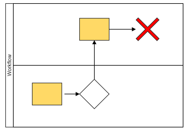
 Swim lane diagrams are a visual way of documenting business processes.
On this pageJump to a section
They’re particularly good at distinguishing tasks between people – using either horizontal or vertical grids. However, there are limitations to consider before diving into the deep end of a swim lane.
1. Unable to share tasks
Swim lane diagrams were designed to separate tasks between people – but what if a task is shared?
If a task is completed by a single person, team or business – it easily fits into its own lane – but a modern workplace often calls for collaborative and shared work.
You can’t simply split lanes, doing this would break the very thing that makes it a swim lane diagram.
2. Decisions based on rules and procedures
If each lane represents a person, team or business – where do decisions not from people but rules and procedures go?
Often this is done by placing the decision with the person doing the task – but this leaves an awkward and somewhat misleading impression that they are making a decision – when instead they’re just following the rule or procedure.
3. Complicated processes look like spider webs
Swim lanes are great for high level process mapping – but be warned – the more detail you at the messier and less useful it gets.
When creating these diagrams I often feel like there’s a fine tipping point of detail vs usefulness.
Ultimately it’s best to stick to high level detail and supplement the diagram with detailed written documentation.
4. Lack of detail
Keeping to high level detail means a lack of detail – which reduces the usefulness of using the diagram to analyse the full business process.
Most significantly – there’s no place to explain why tasks or decisions take place.
5. Not suitable for big processes
Big complicated processes involve many people and tasks.
Swim lane diagrams don’t scale well – when you start loading them up with people and tasks you end up impossible narrow lanes and tiny text.