Google Analytics provides a wealth of information about how and where visitors have interacted with your website.
But sometimes it’s hard to get your head around the pages of tables of information.
This is where heat maps come in handy – being able to see the information displayed along side your actual pages makes it much easier to understand what users have interacted with and where it relates to on the screen.
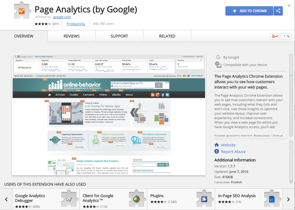
Google Analytics allows you to do this using the a addon for Google Chrome – Page Analytics (by Google). It may not be as effective as a dedicated heat map tool (for example, some tools will record the path a mouse has moved and if it has clicked on a non-linked elements) – but it still allows you to understand a lot about more about your website from a visual perspective – such as elements below the fold aren’t getting clicked, or an icon is not being interacted with because it doesn’t look interactive.
To use the addon you need to have Google Chrome installed and then install the addon.
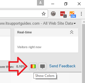
Once installed the Analytics icon will be at the top right of the window.
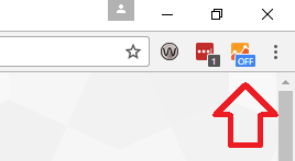
When you’re on a website that you control you can set it to ‘on’ and then use the “show colors” icon to display Analytics data as a heatmap.
Crude but free and (mostly) effective.
There are a couple of catches – for example, if you have the same link in two places on the page it will not know which one the users are clicking on.
Reference: https://support.google.com/analytics/answer/2558811?hl=en